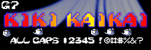
G7 delivers a gritty font captured from the lettering used in one
of the most addicting arcade shmups ever, and does it with flair. |

When computers talk, 256 Bytes is the font they see in
their minds. |

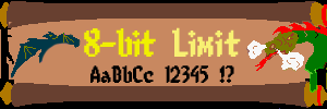
8-bit Limit reminds us: "Don't shoot your friends!" |

G7 continues the tradition with another font based on the screen
text in the famous Sega shooter, one which personally made a fortune
from Your Emperor at the local arcade. |

The PizzaDude delivers some old-school-style block
lettering that makes Your Emperor long for the days of the 80's
arcade. |

Font-a-licious Fonts has cracked the last problem video game fanatics
had...that of how to enjoy arcade games even in the dull, work-a-day world of text.
Mystify your professors, annoy your parents, alienate your loved ones, and endear yourself
to all right-thinking gamers with this gorgeous dingbat font. Click
HERE to preview! |

Crackman is by Ray Larabie, and is a wonderful Pac-Man inspired font.
There are several little dingbats of video-game-ish images throughout. Made me want
to buy another Namco Classics Disk. ;-) |

The most famous first-person shooter ever, and possibly the best, Doom has now
been ported to almost everything including the GameBoy Advance, and now
there is truly no escape from the Doom
demons. This font will give you an alphabetical edge when sending Deathmatch
invitations. |

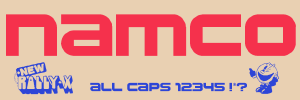
Picket-fence cute faux-westernized digital madness, courtesy of
G7 by way of the madmen at Namco. |

G7 brings us the pixelated spirits of Kiki Kaikai. No
spooks in the font, but creepy, jaggy ambiance. |

Ah, the early 90's, when a quarter and a convenience store with
a video game meant an afternoon's diversion. I can still taste
the microwaved burritos. Another slice of digital life from G7. |

The small screen gets some readable text, and the savings are
passed on to you (and your artwork) in this nifty little easy-on-the
-eyes alphabet styled after the text style on a famous (though outdated)
portable
handheld. (Read the initials if you're mystified.) |

One of gamedom's lesser-known development houses, Imagic created some of the
finest games ever made for both the Atari and Intellivision systems. This beautiful
font recreates the distinctive lettering style used on all Imagic game boxes. |

A terrifying Space Invaders font! Now you can experience the horror of
space invaders (both traditional and new, letter-shaped) marauding into your documents. |

Another Ray Larabie creation, Joystix uses the same font that Namco and other
game companies used in the arcade games of the 80's. This was the
second video-game font I'd ever seen (after "Invaders"), and
at first I had it tucked away in a "Futuristic" fonts page,
which explains the subtitle up there. |

Now your text, too, can have that digital pink puffy cute
factor, thanks to Kirby No Kira Kizzu from Aenigma
Fonts. |

One of the world's premier game producers now gets the font
treatment! A nifty and easy-to-see alphabet that will
"Pac" your artwork with punch. |

G7 sets you up in 8-bit stealthy style with Ninja Kid 2, a
font that's cute but deadly. |

Neale Davidson's take on the famous dot-muncher lettering style...simpler
lines and construction might or might not be a better choice than Crackman, depending on
the size and complexity of your document, but either way you're definitely going to be
munching dots. |

When it appeared on the Nintendo64, Quake became a video game...hence it's
appearance here in my video game font section. Perfect for that Quake Clan
brag page artwork. |

With excellent retrogame font Robotron, Meanworks tasks you to
save the last human family...in writing! |

The Claw himself delivers a typeface from the glorious
golden age of the 80's arcade! Now you can order lunch properly,
by typing "I HUNGER!" |

The videogame wars began with the release of the mighty Atari
VCS, known to some as the 2600. The Atari design aesthetic is
hereby preserved in Atarian System by ShyFonts. |

Taking the battle to the next level, we have Intellivised (by
ShyFonts), a font which will give your textwork just the touch of
"running man". Be grateful your mouse & keyboard
are easier to use than that controller. |

The jewel in Capcom's crown becomes a font! Although there
isn't a lot of text in SFII to use to generate an original font, this entry by Joseph M.
Pence comes as close as Your Emperor would care to get...and when you add in the wonderful
Capcom SFII dingbats, you have a font that'll give your documents the Dragon Punch they
deserve. |

As the fog begins to surround you, the hideous growling comes
closer and closer, and your footsteps, unnaturally loud on the
graveyard pathway, get faster, but you're not running. Yet.
From SDFonts.
|

From OMEGA Font Labs, staffed by the ubiquitous Dr. Nimbus, we have Space
Gimboid. It presents us with classic vector-drawn images reminiscent of
Cinematronics spacecraft from years gone by. This may or may not be what Dr. Nimbus
intended. ;-) |

Y'know, eventually there's only going to be one computer,
but it'll work like ALL of 'em. |

Here we have TRON,
from the movie and the video games...still one of the finest cinematic moments in game
history, the beautifully hand-drawn TRON font includes several exotic dingbats to help you
in your quest to destroy the MCP via the alphabet. |

Another excellent "vector-look" font, this little
gem from Freaky Fonts does a
great job of giving your text that late-80's glitz. This font also
includes some great dingbats. |

Play Mortal Kombat on your Sega Genesis with a friend in
another city...ah, the good (bad) ol' days... |

Wouldn't you like a font that simulates a huge, never-ending
game of Pac-Man? Sure you would. And AKIHIRO
OYA delivers in Videobeast 80's.
|


